Client
The Makery
Summary
I designed an e-commerce product page and cart experience to give the anxious peace of mind.
My Role
UX Design
UI Design

The Goals.
Purchasing furniture is intimidating. It costs more than a pretty penny, and there’s always a fear that no matter how much you measure your space, the item still won’t be the right size. In order to achieve maximum confidence in orders, I focused my efforts on:
1) Clearly displayed product information
2) Minimizable cart drawer
3) Applied visuals
4) Digestible reviews


The User.
The user for Worker Bee Carpentry can’t afford the time, money, or inconvenience of making a poor purchase and going through the process of returning the item. They are meticulous and prefer being confident in their decision before taking action.
How can we make users confident in their purchases?

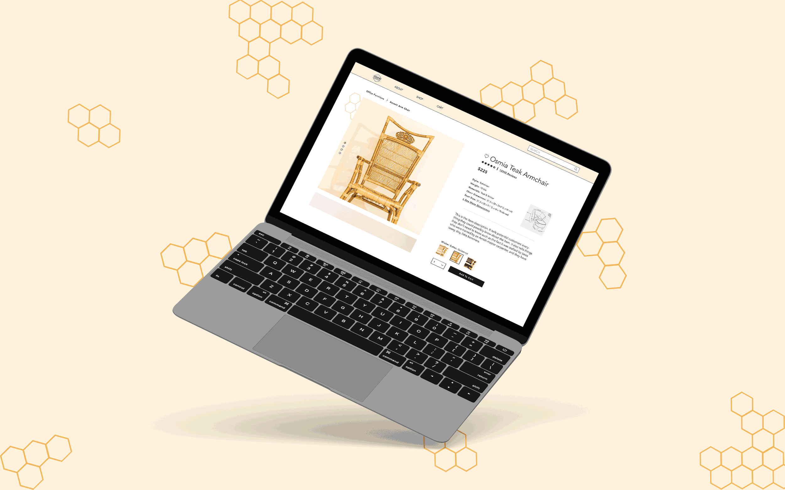
✓ Clearly displayed product information.
Providing as much information as possible was important for the users to be able to clearly visualize how the product would fit in their space. This was achieved by not only giving the item dimensions but also displaying them in a diagram as well as showing the colors applied to the product instead of just showing a color swatch.
✓ Minimizable cart drawer.
With the cart being minimizable, the user will be able to check, double-check, and triple-check the items that they are ordering without navigating away from their current screen. However, if a customer isn’t finding the minimizable cart relevant, they can close it out completely. This action follows the Flexibility And Efficiency of Use Usability Heuristic.
✓ applied visuals.
User Research found that a main point of insecurity when buying items had to do with color accuracy. It’s hard to tell if an item will look good with that much light yellow based on a little swatch. This is why users can trigger a full-sized image with the color applied simply by hovering over the desired color swatch. Once clicked, the new color swatch is selected with the main product photos also reflecting the color change.
✓ digestible reviews.
Researching the online shopping habits of self-identified anxious people revealed that they were ~very~ thorough while researching the item. Some preferred to read the lowest reviews first, some wanted to know the breakdown of certain characteristics that the item possessed, and others wanted to be able to search reviews for a specific concern such as color accuracy.
This brief overview visually presents all of the information at the forefront and doubles as a way to filter the reviews to their preference. From there, they can read uncluttered individual reviews and be ~very, very~ thorough before finalizing their purchase.
The creative brief for this project only needed a single item page, so I tried to fit as many features as possible that would make the product’s details explicitly clear. If this project were to expand, there are exciting concepts to explore such as item comparisons.