
Client
Meijer
My Responsibilities
UI Designer
UX Designer
UX Researcher
Summary
Meijer is one of the largest grossing retailers in the United States and is credited with pioneering the concept of the supercenter. While working as a UX/UI Designer on the Mobile App scrum team, I designed the experience for users to repurchase items from a past order — focusing on giving users transparency and control while working within the technical limitations.

The context.
When Order History was redesigned, it gave us the opportunity to design the reorder function with a fresh start. I collaborated with our UX Architect to create three potential concepts and built prototypes for an A/B test to determine the most appropriate experience using data to drive our decision-making.
Technical constraints.
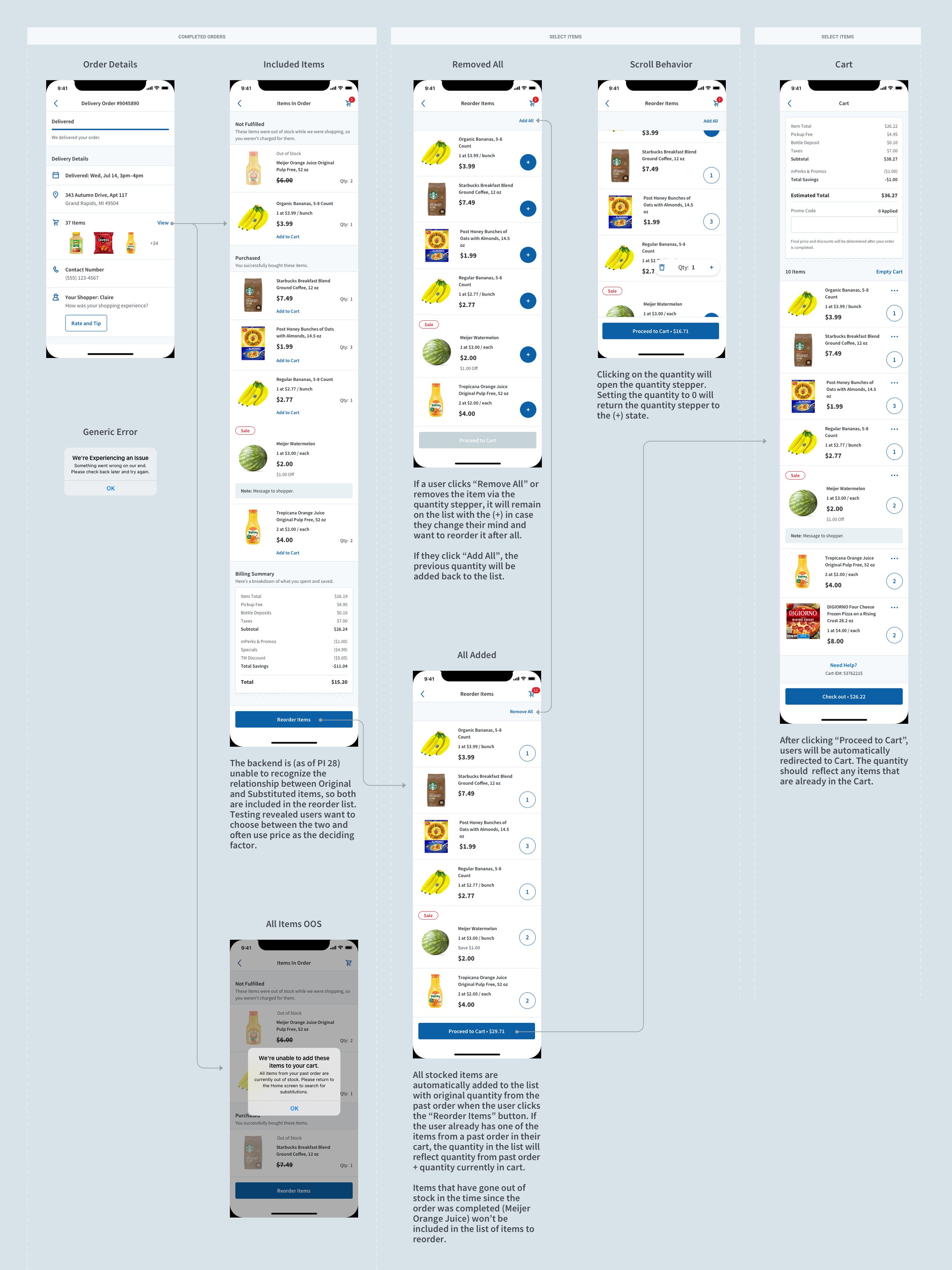
One of the largest challenges in this project was the technical constraints. The backend functionality wasn’t able to recognize the relationship between an original and substituted item. This means that when a user ordered Organic Bananas → and they were out of stock when the order was fulfilled → and then regular bananas were substituted → the app was unable to associate the two. On the Order Details page, the app would categorize the Organic Bananas in the out-of-stock section and the Regular Bananas in the purchased section without displaying their relationship to one another.
We needed to consider how to handle an edge case where both items are back in stock at the time when the user returns to a past order to repurchase those items. Under no circumstances did we want users to accidentally order duplicate items. Each of the prototypes had Organic Bananas that were originally out of stock and substituted Regular Bananas currently in stock to act as a red herring, which would reveal if users understood this nuance.

The Questions.
For the first round of testing, we set out to learn:
Which version did the user prefer?
What qualities did this experience have that established the preference?
Would the user notice when they put two similar items in the cart (double bananas)?
Would users want the ability to choose between their original or substituted item in the case where the original came back in stock?
“I don’t like being surprised with being overcharged for something that I did not realize I ordered.”
-Anonymous User

This system used color-coded notes and emojis to quickly identify helpful quotes, whether duplicate bananas were ordered, or if the user failed the task.
Synthesizing Data.
To ensure I learned as much out of this study as possible, I sorted the data into three different sections:
A summary of the test and key results
An overview of results for each prototype
In-depth notes and key quotes from each test user

The answers.
Select Available Items: This concept had a lukewarm reception, and users found the extra steps confusing.
Automatically Add Available: Many users liked the simplicity of the Toast concept when all available items are automatically added to the cart. However, over half of the users who chose this as their main or backup preference didn’t notice when they ordered duplicate bananas.
Choose Between Original and Substitutes: Looking at the quantitative data, the users preferred the dialog where they would select whether they wanted all substituted or all original items added to the cart. While analyzing the qualitative data from reviewing the user testing recordings, we learned users preferred this experience because they valued the control and transparency over what they were adding to their cart.
Iterating and reiterating.
From the qualitative data, we learned that users wanted to be able to edit quantity before adding items to their cart, they wanted to choose between substituted items or original items if they were cheaper or tasted better, and they were confused by the section headers in the Item Details screen.
Based on this information, the UX Architect and I agreed to move forward with iterating on the Select Available Items because even though it received a lukewarm response from our testers, it gave control over nuanced situations and had potential for growth as new features are released.
The prototype was tested with a SUS (system Usability Scale), which asked questions such as: “I thought the system was easy to use.” The users then ranked to which degree they agreed with the statement on a scale from 1-10.
Retesting.
We retested the Select Available Items concept after workshopping the section header verbiage, building a more robust prototype, and allowing the user to edit the quantity from the Reorder List before adding the items to the cart. This prototype went through the next round of testing using a modified System Usability Scale, where it performed much better in comparison to the previous test.
“I would use this feature a lot. My weekly grocery orders are almost always identical and this would make ordering groceries easier and faster.”
-Anonymous User
Developer assessment.
The design underwent one last iteration after discussion with my team’s developers. They were concerned that disconnecting the quantity steppers’ direct relationship with the cart in order to create a staging area to adjust quantities before adding items to the cart raised risk of destabilizing the app. To mitigate this concern, the concept was tweaked to maintain a direct relationship with the cart that would automatically adjust the quantity in the cart as the user adjusts the quantity in the Reorder List screen.
Final thoughts.
While I am proud of this experience and the work that went into it, it is far from finished. Once the backend is updated, an ideal state would have clearer communication about the relationship between original and substituted items in both the Order Details and Reorder List screens. This experience’s iterative approach delivered value to our customers while buying time for the backend to be updated.