
The Client
The Makery
Summary
I designed an eLearning concept that makes it easy for users to pick up where they left off.
Role
UX Researcher
UI Designer


The goals.
The redesign of Makery U aims to fulfill the the diverse needs of the experienced designer who wants to make a career shift (ahem, me in May 2020) as well as the high school students that The Makery pairs with who may receive the course as homework. In order to achieve this, I focused my efforts on:
1) Designing an interface that streamlines students’ ability to pick up where they left off
2) Assisting students in keeping track of assignments
3) Optimizing mobile view for learning on the go
4) Minimizing distractions with clean design


Research.
I had the privilege of observing The Makery group teach high school and college students during two virtual UX design workshops. While the students were mostly quiet and taking notes, they were able to submit written questions. Due to these, I was able to make note of what kind of questions the students asked, which then informed me what their general design skill level was and helped guide parts of the persona such as Joey Fredrickson’s frustration with a lack of foundational skills. Additionally, observing that some of their eyes were staring blankly at the ceiling or that they were preoccupied with setting tropical video backgrounds informed that they can be easily distracted.
How can we support students learning at their own pace?

✓ Leave and return to course.
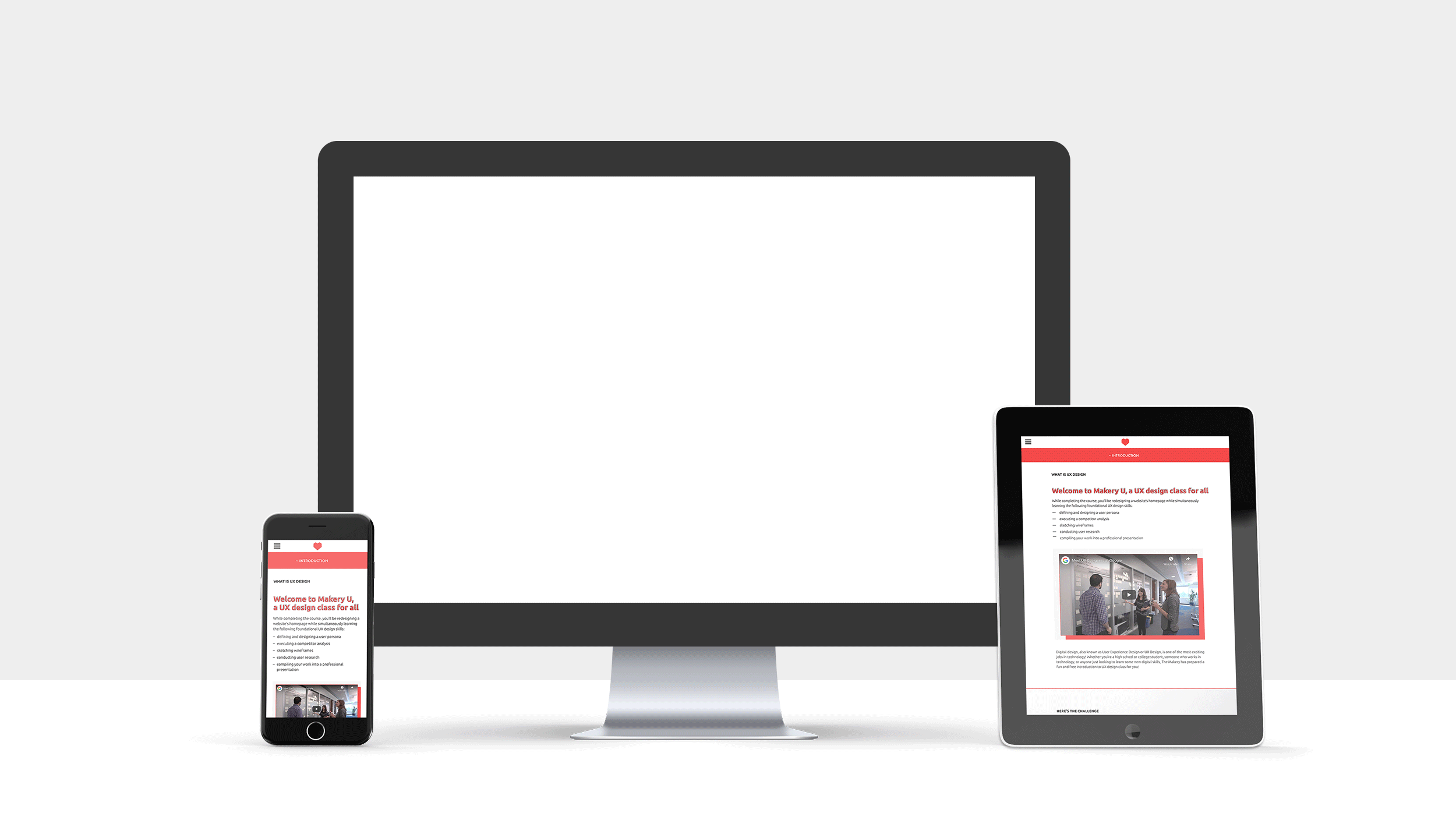
With an established designer completing the course around regular work hours and high school students following a teacher’s assigned schedule, it was important for users to know exactly where they left off, which is where the secondary navigation comes in.
The secondary navigation features clearly titled, collapsible sections so that they are out of sight and out of mind once completed as well as strategic color usage to make it clear where students currently are in the lesson.
✓ keep track of assignments.
In addition to making it easy for the user to come back to the lesson as needed, the navigation also doubles as a to-do list. As each link is opened, that assignment item is classified as completed and grayed out. Once every assignment in a section is grayed out, the coordinating section header in the navigation is also grayed out.

✓ Optimized mobile view.
Whether it’s a high school student who procrastinated completing the assigned lesson or the working professional hot on the hustling scene, Makery U makes learning on the go a breeze. Complete a lesson while waiting for the bus or in line at the coffee shop.
✓ Minimized distractions.
The overall design of Makery U emphasizes white space and utilizes a minimal color palette with ADA compliant contrast. By eliminating superficial graphic elements, the lesson content shines with the additional benefit of less loading for students learning on the go.